Building levels by the numbers, Part III


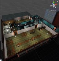
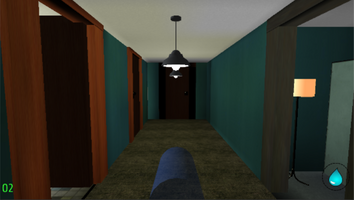
It's been a while since the last entry in this series, and this one will be shorter than usual. I haven't hit any development roadblocks, but I've been pretty busy with other things. It'll also be a little sparse in screenshots, because I forgot to take them and in fact these ones are from later on in the process.
The Restaurant, the level I'm working on right now, will be the first and last night level in FSVR. I wanted to do at least one night level from the beginning, and I do like the look, but it's a lot of work.
Before this level, I didn't worry too much about lighting. I could get away with very few shadow casters in the previous levels, since they're set in daytime and just the baseline ambient illumination looks okay indoors. I had a sun and a few limited accent lights, all realtime, and it ran pretty well even on low-spec devices.
This time, I actually had to light the level properly. Interior rooms needed their own lights to have light, and they needed to be divided with shadow casters to not bleed through. I tried doing it the same way I did before, just with more lights, but it looked awful and ran dirt slow. It was clear I needed to use lightmapping, which is something I'd only toyed with before and hadn't had a good experience with.
This is a definite change for me from GZDoom. In that engine, having an indoor and an outdoor area was super-simple and dirt-cheap. One sector bright, one dark. I've heard modern BSP-based engines are better for this than Unity.
It took me a while to figure out how to bake lightmaps without using Unity's entire GI system. Which can look great, but my previous experiments with the system in Unity 5.5 and 5.6 were not so stellar, and again I'm concerned about resource usage. So, my loss is your gain. For old-style lightmapping, you want to disable realtime GI, enable baked GI, and set the baked GI mode to Subtractive. This is the recommended mode for mobile devices as per the Unity docs. The performance impact is pretty low, and using very low resolution lightmaps looks good enough on mobile devices and makes a small file size.
I had to be careful about a lot of things I'd never thought of before. Lightmaps have to be gitignored or I'll run out of LFS storage real quick. Some objects didn't have proper lightmap UVs- Unity can generate them but needs to be specifically told to do so. I had to make sure the right walls cast shadows- and in fact in many places I'm using invisible walls that only cast shadows that are simpler than the visible geometry. Only a few per-pixel realtime lights can be rendered at once, and that depends on quality settings. Realtime shadows aren't rendered at low quality, but baked ones are. Realtime, mixed, and baked lights affect different objects different ways. Static and lightmap static have greater meaning now, because static objects are lightmapped and dynamic ones aren't. And those fake walls can't be occluder static, because they're not actually visible.
I moved on to the next step once I got the lighting looking good enough, though I'm still tweaking the lighting now and again. The next step is to place the big props- "big" meaning more or less things that will obstruct the player's path- and put together the gameplay of the level. These entries lag a bit, and I'm actually near the end of that stage right now. The big props are in, most of the gameplay is working, and I've started to drop in details.
I've always loved the level design of Duke Nukem 3D because of the way it's inspired by the real world, and I try to do the same thing here. These levels should work not just from a gameplay point of view but also a functional one. An restaurant should look and feel like a real restaurant, with all the things that make a restaurant function. Fortunately, the Unity Asset Store makes it easy with tons of cheap props I can drop in to furnish a level. Everyone's been to a restaurant, and on top of that some of my family are restaurant people, so I had a decent point of reference to build a plausible level. In this case, that means a dining room, bathrooms, kitchen, stockroom, and some surprises in the back. You'll notice I've reused some props from the last level- every byte counts when it comes to the finished product. And of course lowpoly is always good.
The next update will be all about gameplay, including level flow, scene controllers, and the "Action Special" system.
Get Firefighter VR+Touch
Firefighter VR+Touch
A firefighter simulator where you can burn people
| Status | Released |
| Author | XCVG |
| Genre | Action |
| Tags | fire, First-Person, Parody, satire, Virtual Reality (VR) |
| Languages | English |
| Accessibility | Subtitles, Interactive tutorial |
More posts
- Support Has EndedDec 20, 2019
- The End Of The LineNov 28, 2019
- The Final UpdateMay 03, 2018
- Of Sunk Costs and Shifting PrioritiesFeb 21, 2018
- On Time and Under Budget (mostly)Dec 05, 2017
- Pivot and Polish: A New PlanOct 28, 2017
- A Brief Update, and Notes on VRSep 27, 2017
- Building levels by the numbers, Part VAug 31, 2017
- Building levels by the numbers, Part IVAug 24, 2017

Leave a comment
Log in with itch.io to leave a comment.