Building levels by the numbers, Part V


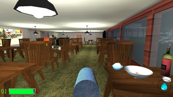
We're at the end. I've gone through how I design, assemble, and lay out levels, and all that's left is a few notes on detailing and finishing touches. In fact, the Restaurant level is already complete and closed testing will soon begin.
I'm of the belief that a level tells a story, not just explicitly through cutscenes and messages but implicitly through the structure and detail of the level itself. I know there's a word for this, but it escapes me at this moment. When I hit the detailing phase of a level, that's where I really get going with this.
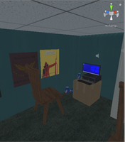
For the first level, Apartments, I started by thinking about who would live in each apartment and what their story would be. One is an ex-Marine, with his Purple Heart mounted on the wall. Another is a cash-starved gamer, with posters everywhere and a cardboard box for a desk. Because of the nature of this game, I threw in a few jokes and references, too. I had to limit it a bit, though, to keep the game smooth and the file size small. If I wasn't building a mobile game, I could definitely do a better job here. It's important to keep polycounts low, textures small, and reuse as much as possible, which runs counter to making a plethora of unique apartments. I may go back and add more detail once I have a better idea of performance.
I spend an unreasonable amount of time making posters, placards, notes and other flat set dressing. This is kinda the fun part for me. Most of these pieces are assembled from free stock photos and clipart, though some are from scratch. In-game, each is a texture applied to a quad. I know this is a terrible way of doing it. Ideally, several posters should share a material and texture to save on resources. But I don't know the first thing about modeling or UV mapping, so this is how I do it.
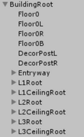
This wasn't a big issue for the Restaurant, which only has one storey, but for the Apartments I had to make sure all the storeys were actually enabled when I was done. I separated everything out by storey so I could enable/disable just a few objects in the hierarchy to get everything out of the way and work on a lower storey. I also rebuild the occlusion and lighting data, because not doing it can lead to some... interesting glitches. Both are a quick process for Apartments but lighting takes a while on Restaurant because of its lightmaps. FSVR doesn't use navmeshes- although maybe it should- so I don't have to build those.
There's actually not much testing at the end. I'm firmly in the camp of "test as you go" and iterative development, so most of the testing happens in the gameplay development phase. At the end I do a run-through to make sure everything still works and look for new glitches that pop up. There are usually a few minor things- mostly visual things- to fix at this point. After that, well, it's time to playtest and move on to the next one.
That's the story of a level. I'll be talking about the challenges of VR next week, provided nothing else gets in the way. Thanks for reading!
Get Firefighter VR+Touch
Firefighter VR+Touch
A firefighter simulator where you can burn people
| Status | Released |
| Author | XCVG |
| Genre | Action |
| Tags | fire, First-Person, Parody, satire, Virtual Reality (VR) |
| Languages | English |
| Accessibility | Subtitles, Interactive tutorial |
More posts
- Support Has EndedDec 20, 2019
- The End Of The LineNov 28, 2019
- The Final UpdateMay 03, 2018
- Of Sunk Costs and Shifting PrioritiesFeb 21, 2018
- On Time and Under Budget (mostly)Dec 05, 2017
- Pivot and Polish: A New PlanOct 28, 2017
- A Brief Update, and Notes on VRSep 27, 2017
- Building levels by the numbers, Part IVAug 24, 2017
- Building levels by the numbers, Part IIIAug 21, 2017

Leave a comment
Log in with itch.io to leave a comment.